There are a few questions I've been asked on more than one occasion. I thought it was about time to address those questions in a blog post.
Read More
Posts on branding & websites, business and client work.
There are a few questions I've been asked on more than one occasion. I thought it was about time to address those questions in a blog post.
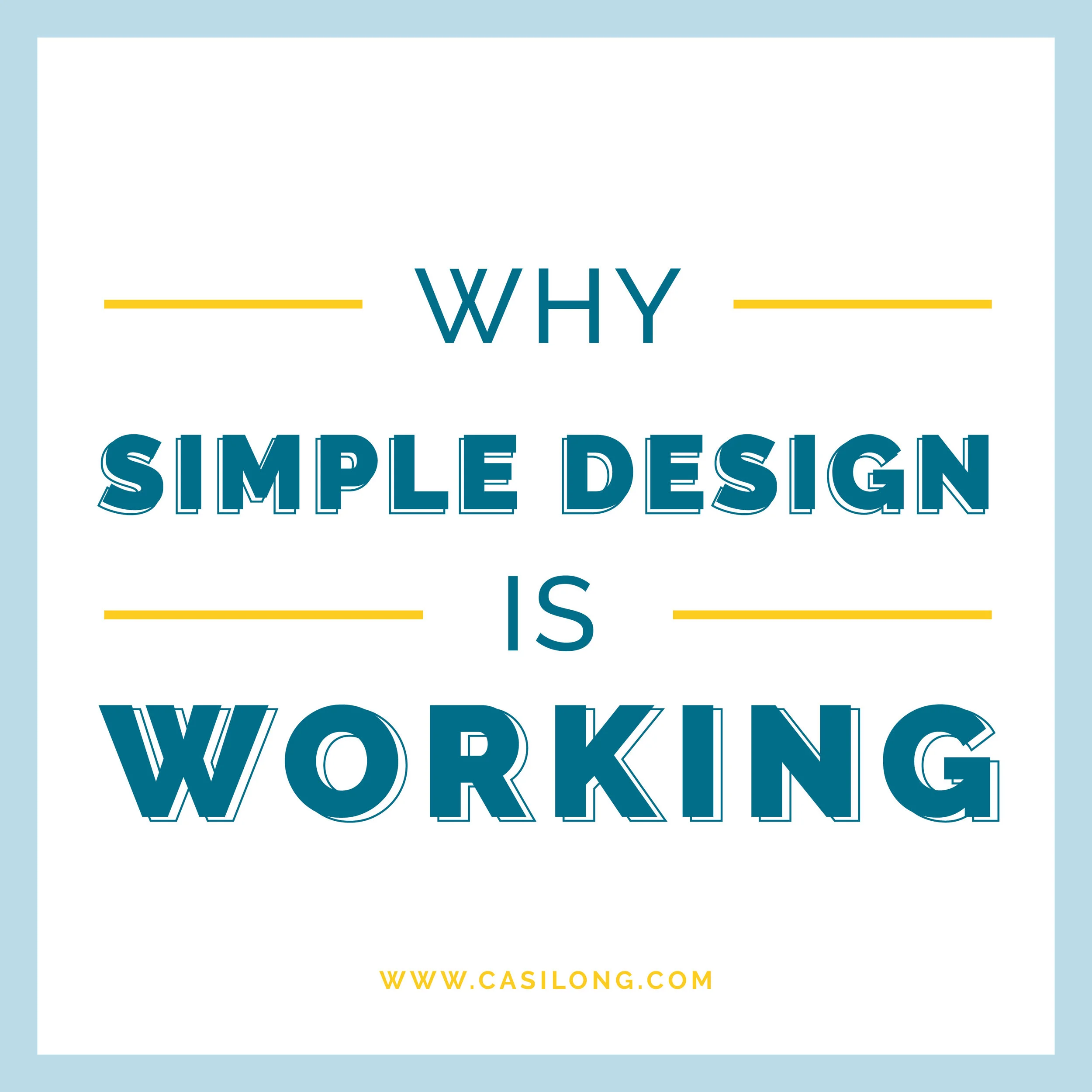
Read MorePeople often think good design equals more design. More colors, shapes, photos, patterns. However, the most effective design is often what appears to be less design, when in reality it’s simply smarter, more efficient design.
I ran across this quote and I thought it summed up my thoughts quite well:
“Apple pie has endured through the years because it’s something people easily understand. In the same way, a simple, classic design that doesn’t require your audience to think too hard to understand the message will still be relevant after years of fancy fluff and bad trends have come and gone.” —Speckyboy Design Magazine
In a world of fast-paced, hustle and bustle, I for one think simple design is working quite well. Here’s why:
Read More
In the past two posts you read about how non-designers can use alignment, white space, hierarchy, and typography to create professional-looking designs.
wanted to wrap up this series by talking briefly about how to choose color.
This can be tricky, because color rules are less concrete than other rules like typography. To get you started off on the right foot, here are a few basic rules for choosing the right colors for your design.
When someone receives your designed flyer or postcard in their mailbox, they may only spend 2-3 seconds looking at it before they decide to either keep reading or to trash it.
It’s imperative the viewer sees the most important information first to entice them to keep reading. Hierarchy can make or break a good design piece.
In the last post, I walked you through how to use alignment and white space when creating pieces like flyers, cards and advertisements. If you missed it, you can check it out here.
In this post, I’ll go a step further and discuss hierarchy and typography.
Have you ever tried to design something and couldn’t quite put your finger on why it wasn’t working? If so, this series is for you.
ver the past few years I have discovered a few tips and tricks for designing pieces like flyers, cards, advertisements, magazines, or books.
I will walk you through a few simple rules for making a card.
This series will consist of 3 Parts. Part 2 will be covering hierarchy + typography, and part 3 will be about choosing color.
Let’s dive in.
Read More
You know when you see that superhero mom juggling 2 or 3 kids, a dog, and countless other things and you immediately ask yourself, “How does she do that?” Or when you see the restaurant or coffee shop owner who seems to be working every single moment the lights are on? I have certainly thought, “I wonder how they do that,” so many times in life. I would bet they have a list of “things” they would tell you they couldn’t live without.
I am definitely not a superhero mom (or a mom in general) and I don’t run a restaurant or coffee shop, but as a designer and business owner I also have a list of items that make my life a whole lot easier. Here's my top 10 list.