
How to Select the Best Fonts for Your Brand
Today I’m excited to talk about one of the easiest ways to take your design work to the next level. To be honest, when I look at websites, magazines, billboards or really any professional advertisements—font selection immediately differentiates the best from the rest for me. When selecting fonts for your brand, it’s so crucial to keep in mind the overall vibe you want to convey. Sometimes the most subtle font changes can completely refresh a company’s look or share your message in a stronger way. Ask yourself what words would you use to describe your brand? Who is your intended audience? With what “feel” will that audience resonate most?
For example, if your target audience is made of predominantly male farmers over the age of 40, your brand elements need to portray a drastically different message than if you are trying to reach female CEOs of small fashion and lifestyle companies. Think about the type of clients you want to attract and consider what they might relate to.
In order to decide the type of fonts you want to use, you need to know the basic principles of typography. Don’t let that word intimidate you… typography is just a fancy way to say the appearance of letters. But, to feel confident in the font-selection process, you need to understand the terminology. Take a few minutes to read through my breakdown to help you feel like a typography expert!
Now that you understand the importance of identifying your audience... let’s talk fonts! There are three main categories most fonts fall into: serif, sans-serif and script. I’m confident you regularly see each of these types and once you truly understand the differences you’ll never look at brands and advertisements the same. Let’s break each category down to gain a better understanding of their purposes.
1 | Serif
Serif means with wings (or “a slight projection finishing off a stroke of a letter in certain typefaces”). So the primary fonts you see in business documents or body text with small lines or “feet” on the edges of the letter.
Typically, serif fonts are more traditional, classic, and sophisticated. Popular serif fonts we all use regularly are Times New Roman, Georgia and Baskerville.

Back in the day, typewriters only used serif fonts, so they are commonly used in large bodies of text, like newspapers and books. Serif fonts are typically easier to read because the spacing between letters is greater (because of those little wings!) than that of sans-serif text.
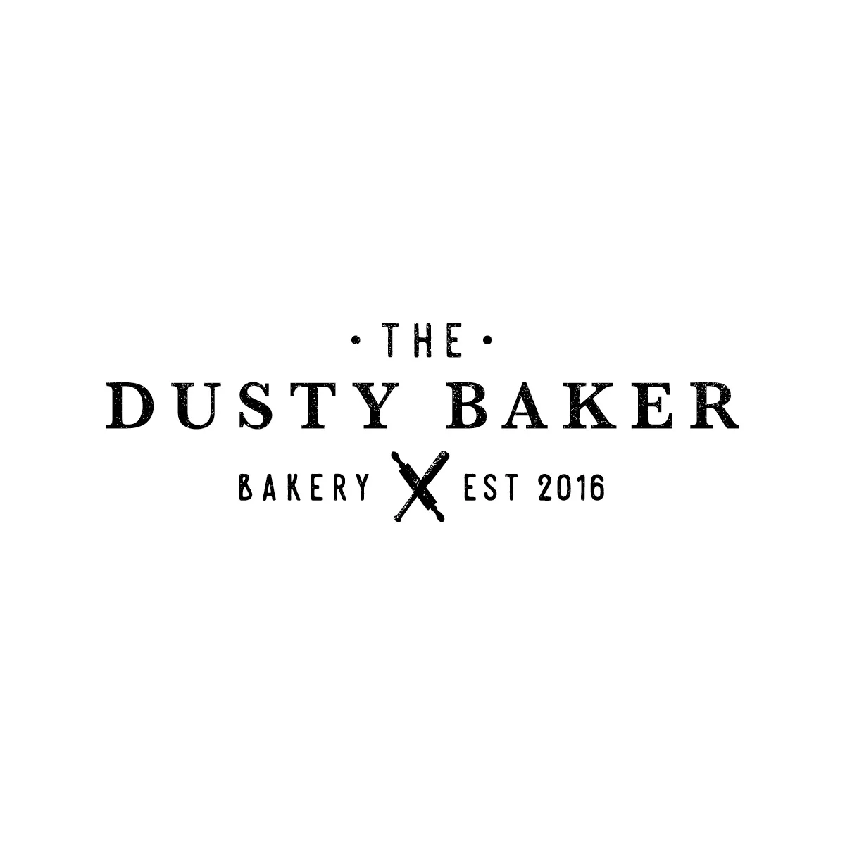
If the majority of your clientele are older (50+) they will likely relate more to a serif font. However, serifs can also be used in a clean, modern way like this:

Personal note: I love the look of an all-caps, serif logo design with increased space between letters (also known as tracking). It’s so clean, classy and timeless… these are the logos that, to me, will never go out of style.

2 | Sans-serif
Sans-serif means without (sans) wings (serif). Makes sense, right?
Typically sans-serif fonts convey a more modern and artistic vibe. They are used less frequently for large bodies of text, although it’s becoming more common. (Like the body text of this blog you’re reading right now… what, what!)
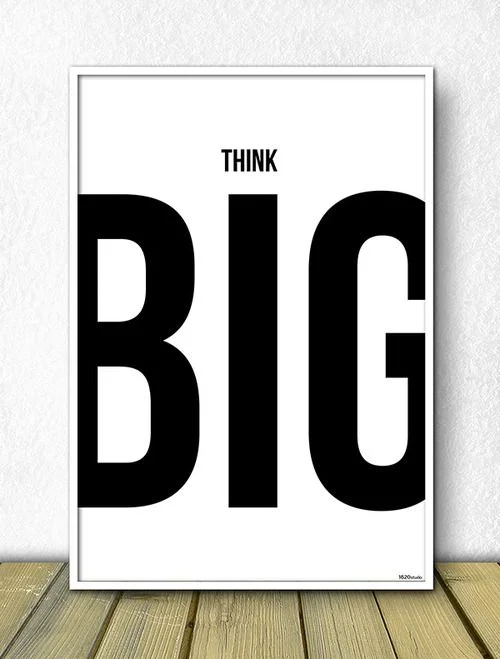
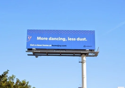
It’s also common to see sans-serif used in all-caps, on large billboards, or as a piece of statement art.

If you’re trying to reach a mostly-millennial audience, they may respond better to sans-serif fonts. Fonts in this category can vary from tall and narrow, to short and wide—and there are a lot to choose from. So again, you will want to consider your audience and the feeling you want your typography to convey.
Popular sans-serif fonts are arial, Bebas neue, gotham, avenir and raleway.

Sans-serif fonts are typically used for a trendy, more futuristic approach. I often see them used in branding materials—such as business cards, one-page flyers and social media graphics—that may only get a quick glance from your audience. Sans serifs are perfect for a design with only one or two main takeaways.
3 | Scripts
Script fonts refer to cursive-style writing where all (or most) of the letterforms connect to each other. Calligraphy has been around for hundreds of years, but modern calligraphy has become an incredibly popular form of scripts in recent years. You may also see scripts in the form of watercolor or a hand-lettered style. Think: all the wedding invitations on your fridge right now!
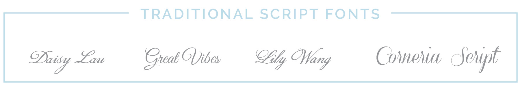
Since there are many different styles of script fonts, they can vary between traditional or more modern. The style of scripts used in the Declaration of Independence and our Constitution are more traditional (like below).
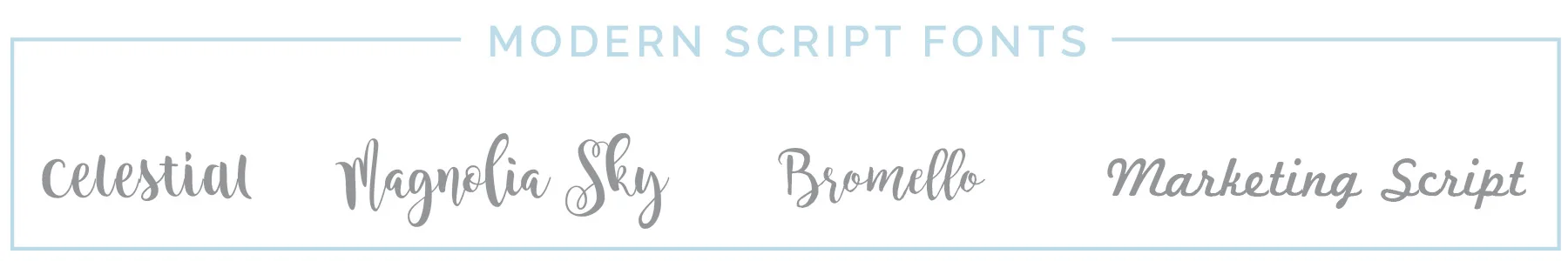
The script used in my logo is a more playful, hand-written style. Here are a few other examples of modern-style scripts.
A general rule of thumb when using scripts is ONLY USE ONE! Scripts are typically the most difficult to read and should be used in a more stylistic way than serif or sans-serifs. Use scripts sparingly and as an accent piece, rather than for an entire paragraph.
This may sound like common sense, but in my experience this is one of the biggest design misuses. Think of a script font like a statement piece of jewelry… good style tells us to have one bold center of attention and let everything else be complementary. Otherwise, your awesome focal piece gets lost in the noise!
4 | Pairing Fonts
Deciding which fonts to use together can often be a challenge. Each person has a different opinion of what looks good. I certainly don’t want to stifle your creativity, but there are a few overarching design guidelines that have proven effective. Here are my basic do’s and don’t’s, but beyond these I encourage you to really look objectively at your brand with that ideal audience in mind!
Yes, do this!
Mix serif with sans-serif.
Mix a script font with either a serif or sans-serif (but not both)
Use varying weights on the same font (ex. Bold with Light) to create hierarchy
Don’t do this!
Use more than one script
Use 2 very similar fonts—contrast is key!
Use more than 3 fonts.

I hope this post helped you to understand the different ways you can use fonts to create really great design pieces. I’m always happy to answer any questions or review any designs if you need a second opinion! As I mentioned above, sometimes very minor font changes (even of fonts in the same family) can have a drastic impact.
If you’re in the business of sprucing up your branding, you may also find this post on choosing a color palette helpful!