
6 Simple Ways to Improve Your Website
Your website is your main point of contact for online clients. You print your web address on business cards and stationery, place it in your emails, and give it to anyone asking to view your work. If you’re a business owner or freelancer, chances are you have a website.
You use your website as a tool to show potential clients your work, tell them about yourself, explain your services, and present valuable content through your blog posts. Ultimately, the purpose of your site is to drive traffic, gain exposure, and book clients.
When you send potential clients to your website, you want to make sure they have a positive experience. After all, it may be the only interaction they have with your business before deciding whether or not to purchase what you’re selling.
Here are a few simple ways to make sure your clients have the positive experience they’re hoping for.

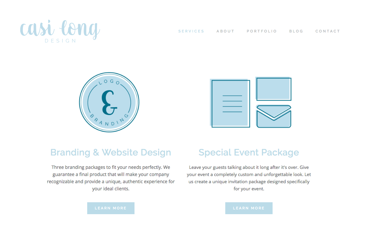
1 | Put action items on every page.
Each page of your website should serve a particular purpose. You should have an idea of what you want your reader to do on each page of your site.
You never want to leave your viewer at a dead end without a clear path of where to go next. Give them options.
An about page is intended for the reader to learn more about you, but you can also use the opportunity to ask your viewer to click through your site once they’ve read your page. Include links where they can contact you, view your services, or subscribe to your newsletter.
The home page should include multiple options for the reader to choose from. A portfolio page should include the option to contact you or learn more about your services and at the end of each blog post try adding an option for the reader to read additional posts.
Here's an example of some action items at the bottom of a portfolio page on White & Salt's website.

Utilize the fact your viewer is on any page of your site as an opportunity for them to stick around longer. Give them plenty of options to choose from.
2 | Simplify your navigation.
Your navigation is designed to do exactly what it says: help viewers to navigate your site. You want your navigation to be clear and concise.
Place the items in a thoughtful order. Set it up in the order of which you want your viewers to navigate through your site.
For example: On my site I want viewers to view my services and acquaint themselves with what I offer. Next, they should read more about me and my story. I then want them to view my recent work, visit my blog for helpful resources, and lastly, contact me to setup an appointment or book my services.
The order of your navigation should have reason and intentionality behind it.
Limit your navigation items to 5 or 6—the fewer choices the better. Readers tend to get overwhelmed by too many options.
For this same reason, I try to avoid using drop-down menus. They are not always a bad idea, but generally speaking drop-downs add a level of complication and tend to overwhelm the viewer. They are often a little fidgety on mobile devices as well.
As an alternative, I like to use landing pages.

Landing pages are great for giving your clients options to click through and you can add details you wouldn't be able to add in a navigation bar. Landing pages also allow your clients to compare and contrast things like service packages, products, and blog post archives.
Another option is to use a secondary navigation in your footer for less important information, like you see below.
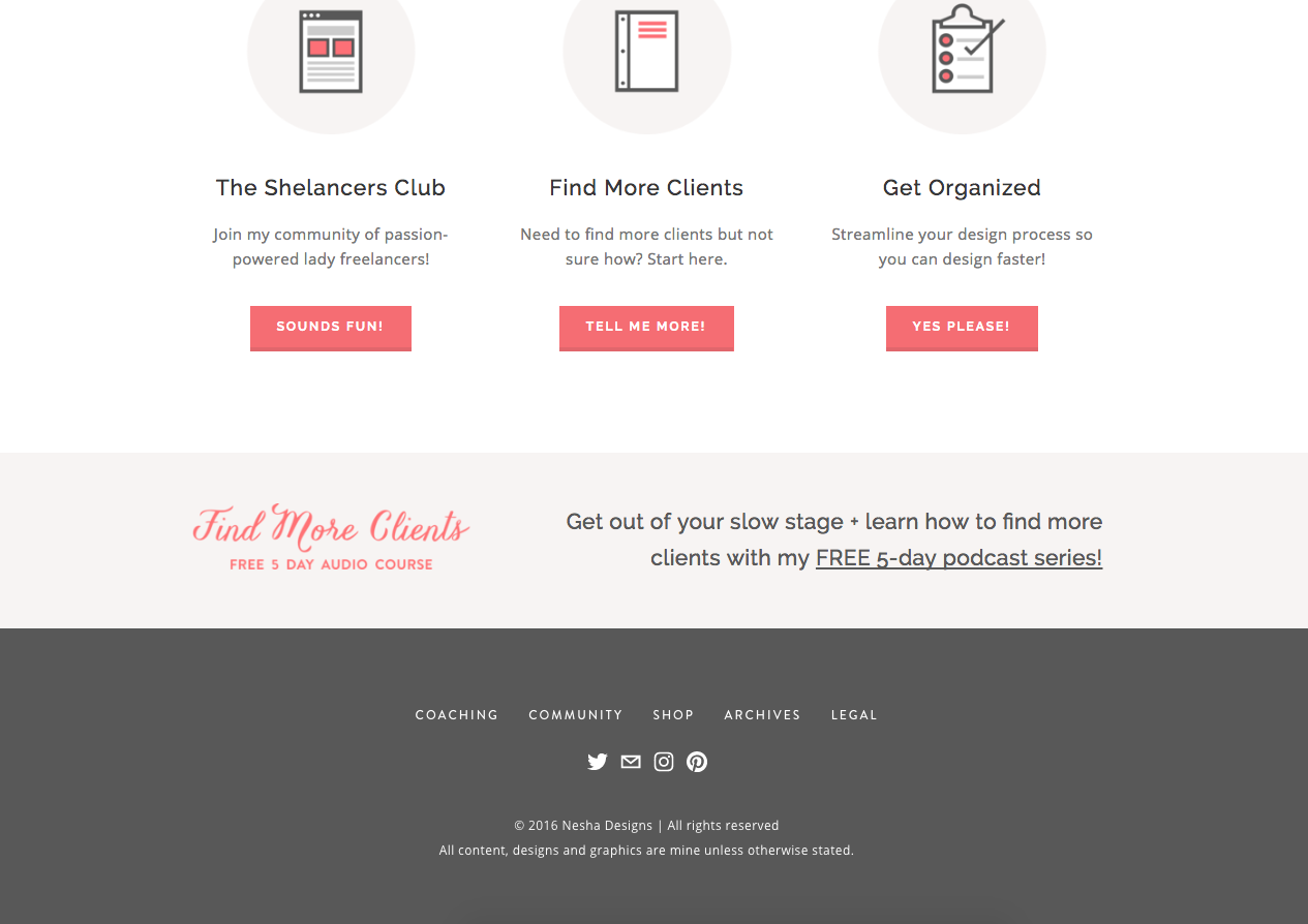
Source Neesha Woolery
3 | Maintain consistency throughout the site
It’s important to maintain consistency throughout each page of your site. You want to make sure every single page looks like it belongs on your site. This will help readers to gain an overall feel for your style and brand. Consistency will help your readers to have a unique, authentic experience with your website.
A few ways you can create consistency is to:
Use 2-4 specific colors.
Choose two to four colors for your brand and stick to them. My website uses 2 main colors and a gray color for most of the text. Some choose to use a few more than this and that’s OK—as long as it remains consistent.
The color of your buttons throughout the site should all match, as well as items like headers and links. Try to avoid switching up the colors from page to page.
Make sure your images are the same size and shape.
This can be easy to overlook, but using the same size and shape for your image page headers will really sharpen the look of your site. Also, if you have a group of images—like an archive of some sort—keeping the images the same size will appear clean and make it easy for your viewers to find what they’re looking for.
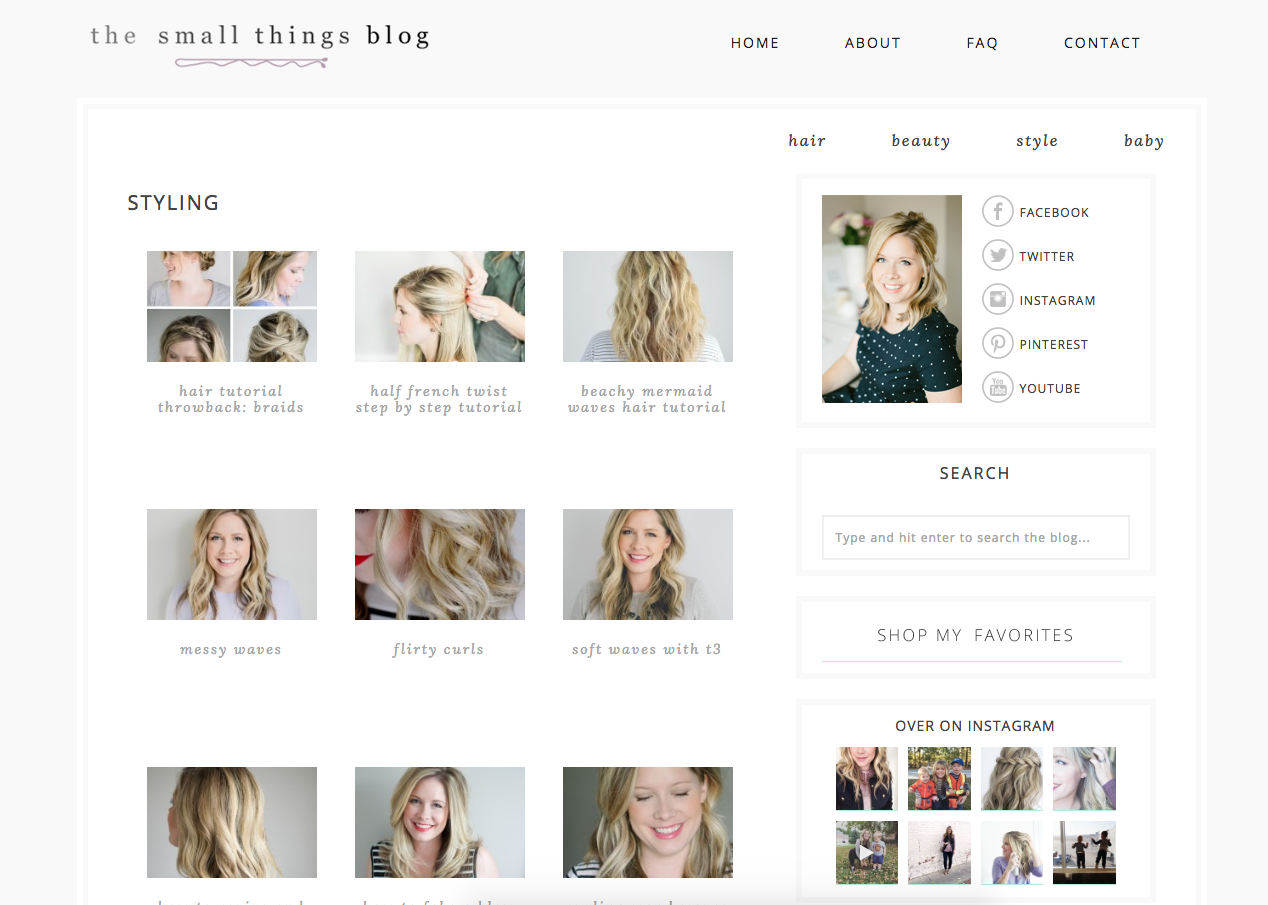
Source the small things blog
Try and use 2-3 fonts throughout the site
Sticking with two or three fonts has multiple benefits. It will help your viewers to have a great, easy-to-follow experience on your site. Pairing down fonts will make your graphics recognizable when you share them across social media, and it will streamline your creation process.
Use one font for all your headings, and one font for all your body text. I use the sans-serif font from my logo as a main font throughout my website.
4 | Make it easy for the reader to find what they’re looking for.
There’s nothing worse than visiting a website to look for a specific product or blog post and not being able to find it. You want to avoid this at all cost. Don’t give your readers a reason to leave. Instead, give them more reasons to stay!
Here are several ways to help your readers find what they’re looking for:
Place important information above the fold.
The term “above the fold” simply means the area of your site that viewers can see without having to scroll down the page. If you have one major goal you want all your site visitors to see, place it front and center so they really can’t avoid finding it.
Place search bars in your footer or blog sidebar.
I am a frequent search-bar user. If I know I’m looking for articles on ConvertKit, I will go directly to a person’s search bar and type in “ConvertKit”. Typically, this allows me to find multiple articles and I therefore stay on their site for an extended length of time.
On the contrary, if the website doesn’t contain a search bar and I have a hard time finding articles on ConvertKit, I will return to Google and look for other resources. Don’t drive your readers away with one tiny mistake.
Squarespace makes it super easy to add a search bar. If you need help with this, feel free to reply in the comments below.
Give them more than enough information. Provide easy ways for them to find all your content, using categories, archives, etc.
Utilize your blog sidebar to help readers navigate your blog. Similar to a search bar, readers can click specific categories, or visit your archives to find what they’re looking for.
Also try adding “related posts” links at the bottom of each of your blog posts.
According to evermo.re if you can get your viewers to stay 40 seconds, they are likely to stay another two minutes on your site. Make their first 30 seconds on your site so helpful they will want to stick around.
5 | Add customization
As I mentioned in #3, it’s important to maintain consistency using color. Color can also be used to add a custom feel to your site. When selecting which colors to use throughout your site, try selecting a few non-default options. Choosing a signature color can really make your website and brand recognizable.
You can also add a personal touch by creating graphics or icons and placing them as images on your site.
Here are a few custom icons I use on my site:


6 | Set up your social media icons and links to open in a new window.
This is a simple, but very important rule.
Having links open in a new window will prevent readers from being redirected away from your site. You never know why or how someone ended up on your site. If they stumbled upon it accidentally, you certainly don’t want them accidentally leaving because they clicked on one of your social platforms.
Encourage them to stay on your site as long as possible by having every link or social platform open in a new window.
However, make sure any links to internal pages of your site remain in the same window. As long as the link keeps your readers within your domain name (www.casilong.com) it’s OK to have the link open in the same window.
I would love to hear which of these tips were helpful to you and what other tips you have for improving your website user experience. Let me know in the comments below.
Also if you’re wondering which website platform I use, you can read all about why I recently switched to Squarespace. Which platform do you use and why?