
How to Create Quality Photography for Social Media, Part 1
When I began to work on launching my new company, I knew I would need to develop a specific look for my business and social media platforms. I knew I wanted my brand to be clean, airy and simple with pops of color, but I wasn’t sure how to accomplish that through photography.
I started doing research.
I would google, “How to take professional-looking images,” and “how to photograph for your blog.” I also spent a lot of time looking at what others in my industry were doing. I took notes of what I liked, what I didn’t like, and what kind of props they were using. I debated whether I liked the more organized, aligned style or if I should go for a more organic, messy feel.
While it was great to do research, and it gave me a base knowledge of what I needed to know, I realized I would only truly learn by doing. So that’s what I did.
I started experimenting and figuring it out. And that’s when I really came into my own. Now I want you to do the same—here are the first five steps to taking quality photos.

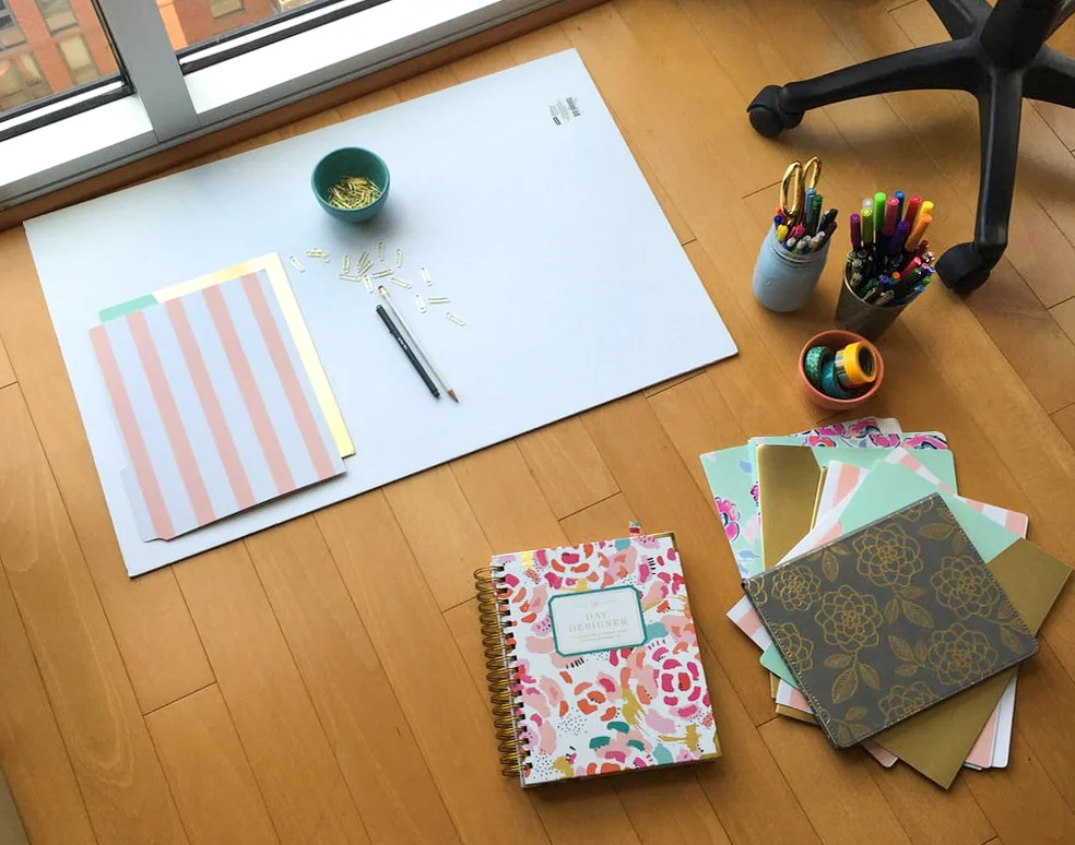
1 | Decide what props to use. Are they brand appropriate?
When finding or buying new props for my photoshoots, I typically try to buy things I will actually use. I knew I needed a planner, so I made sure the cover of the planner would be on-brand and usable as a prop. File folders, notebooks, and paper clips were all things I knew I would use, but could also be cute and colorful as well.
Other items could include:
- colorful pens and markers
- plants or flowers
- scissors
- cute small dishes
- headphones
- anything else you find lying around that matches your color scheme
I’ve seen others use things like pillows, blankets, books, coffee mugs, and other household items.
Seriously, get creative here. Watch what others are doing and think up similar ideas.
I typically try to avoid using food as a prop, simply because it doesn’t relate to my business. I try to use items that seem applicable to what I do on a daily basis, but for you it could be completely different. You’ll have to be the judge of what makes sense to you.
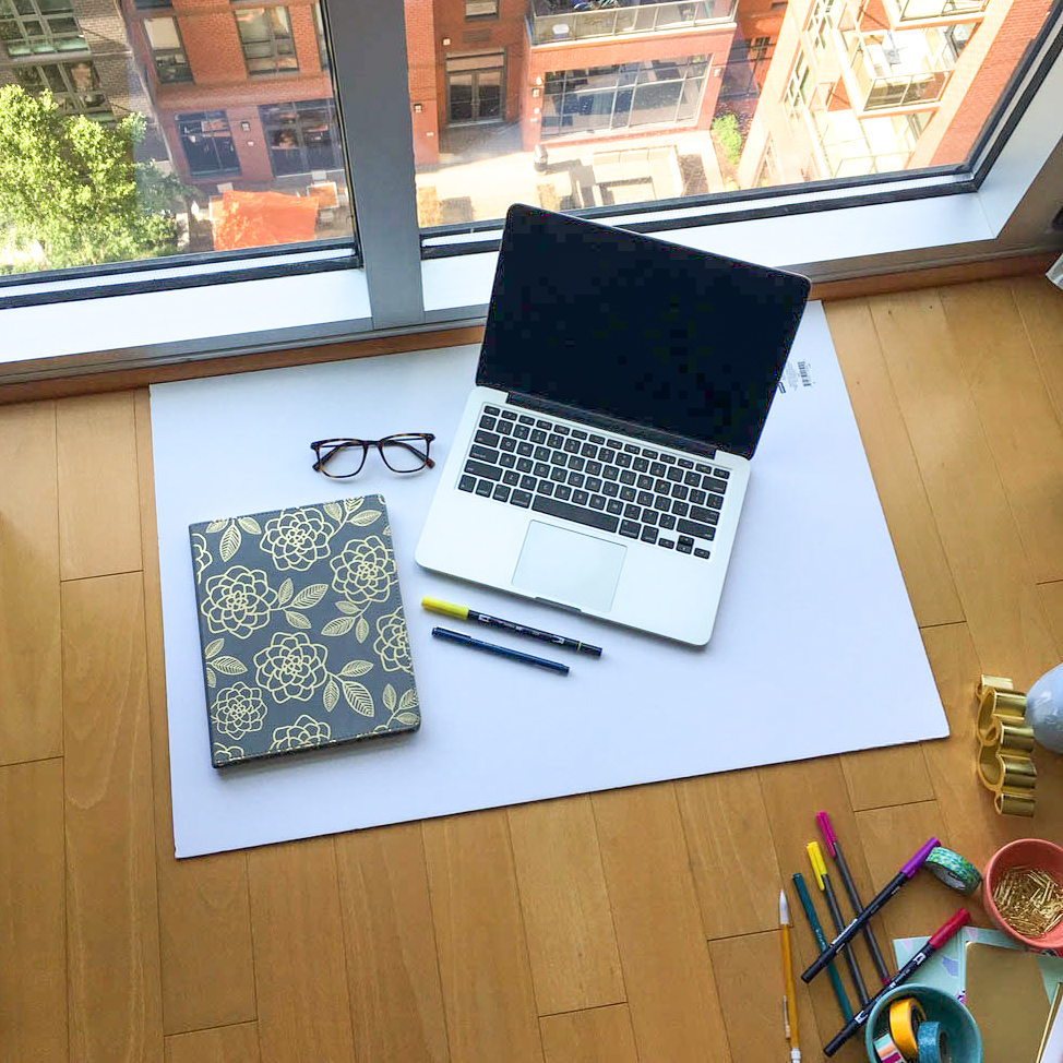
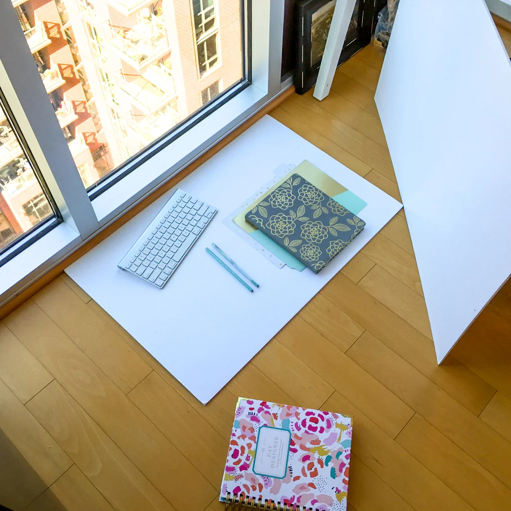
2 | Set up your “studio” using foam board and natural light.
This part will surprise most of you, but the white background you see in my photos is actually white foam board. I place it on the floor right next to the large window in my living room.
When choosing a foam board, you’ll want to select one with a matte finish. Any surface with a gloss finish will cause a glare you don’t want. (This is the main reason I don’t use my desk surface, which is also white.)
I like to pull a bunch of props and place them near my foam board for easy access.

Lighting plays a crucial role in the outcome of your photos.
You will want to choose a spot with the most natural light you can find. Make sure to position yourself—or any other large objects—on the opposite side from your light source to ensure your shot is free of any weird shadows.
You can also use a second white board to bounce light to the other side of your subject.
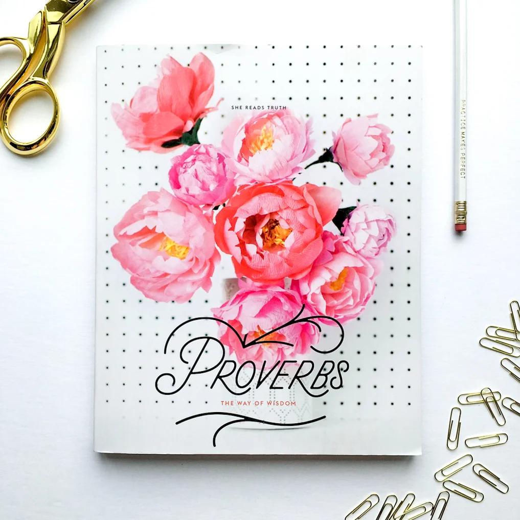
3 | Start styling.
I have a specific style or aesthetic I try to maintain—a lot of white space and a particular color scheme or feel. It took a lot of trial and error before I really understood my style. I mentioned above a few items I use in order to maintain my branding colors, but I also like to throw in my keyboard, mouse, or eye glasses as items I use everyday. It helps the photos to feel more authentic and personal.
There are a couple different methods you can use when styling your photos.
I typically prefer to align my items with each other like the example below on the left.
Another method is the thrown-together, messy feel similar to the middle photo below.
I will often do a combination of the two (below right) that has a mix of organically placed items with structured items.


Remember less is more.
This is true in a lot of aspects, but especially in photo styling. You’ve seen photos with what feels like a hundred things happening and it feels overwhelming. Keep this in mind with composing your photos. Your focus should be on two or three main items and the remaining items should be complimentary.
Try choosing 2 larger items (like a keyboard and notebook), setting them up first and then fill in the gaps with smaller, complimentary pieces (like pens or paper clips).
Experiment with a few different techniques to decide which methods you prefer.
4 | Decide how you want to compose your photos.
I use my iPhone about 90% of the time. I also have a Canon DSLR camera I use when I need more depth of field (blurriness in the background) or need to take a photo of my iPhone.
A few general rules of photography are:
Use Rule of Thirds

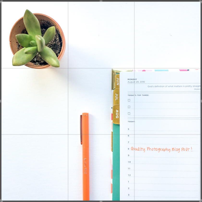
The rule of thirds means your photo is divided into thirds vertically and horizontally.
This creates 9 compartments on your photograph. Any of your main focal points should be on or around one of the intersections (highlighted with yellow dots below). This allows your images to be more visually interesting rather than placing your subject smack-dab in the middle of the frame.
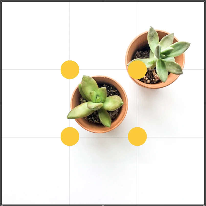
When framing your photo, place your subject in one of the thirds, either horizontally or vertically.
This is a very common mistake people make when snapping photos of their friends or family. The subject's head should typically be in the top third of the photo frame, not in the center.
Think of it as if you’re telling a story and you want to tell as many of the important parts as possible. The more you capture of the subject, the more context it gives to the story.
If you place the subjects head or main focal point in the middle of the frame, you are wasting space toward the top of your photograph, and therefore subtracting context from the viewer.
Here are a couple examples of the proper use of rule of thirds.


Photos from https://unsplash.com/
To read a little more about the rule of thirds check out these articles:
Article One by Photography Talk
Article Two by Digital Photography School
Article Three by iPhone Photography School
Maintain balance and symmetry.
If you are using more than one item in your shot, you want to make sure it’s balanced. If you have an item coming in from the bottom left corner of your frame, you will want to balance it out by having something in the top right corner as well.
It doesn’t have to be perfectly symmetrical, but feeling balanced is important. You wouldn’t want to have a ton of white space in the top right corner if you have almost no white space in the bottom left.
If you are simply using one item in your shot—like my baseball example below—using rule of thirds will help you maintain balance and symmetry.

To learn more, check out this article about photography composition
http://www.photographymad.com/pages/view/10-top-photography-composition-rules
5 | Snap, snap, snap!
Take too many photos.
Move things around, adjust the angles, and try using different combinations of props. I typically take way more photos than necessary so I have more to choose from.
Thanks so much for sticking with me this far. I hope you've learned a thing or two and can apply them to your photography.
Be sure to look out for Part 2 later this week. I’ll help you with selecting and editing the right photos using Adobe Lightroom and Photoshop. You won’t want to miss the second half!
What is your greatest challenge with photography? Which step from today's post did you find the most helpful?
Please leave your responses in the comments below.