
How to Create Quality Photography for Social Media, Part 2
If you read my last post How to Create Quality Photography for Social Media, Part 1 you learned all about how to choose your props, set up your studio, style your photos, compose your photos, and capture your images. You learned a few rules of photography like rule of thirds and balance.
Now that you’ve had time to practice styling and snap a few images, lets talk about selecting the right photos and how to edit them.
Today, I’m going to walk you through my process and talk about the tools I use. I will also break down some of the adjustment tools in Instagram and hopefully give you a better understanding of what each function does.
Upload the images to your computer.
Once I’ve finished my photoshoot, I like to upload the images from my iPhone to my iMac to make it easier for editing.
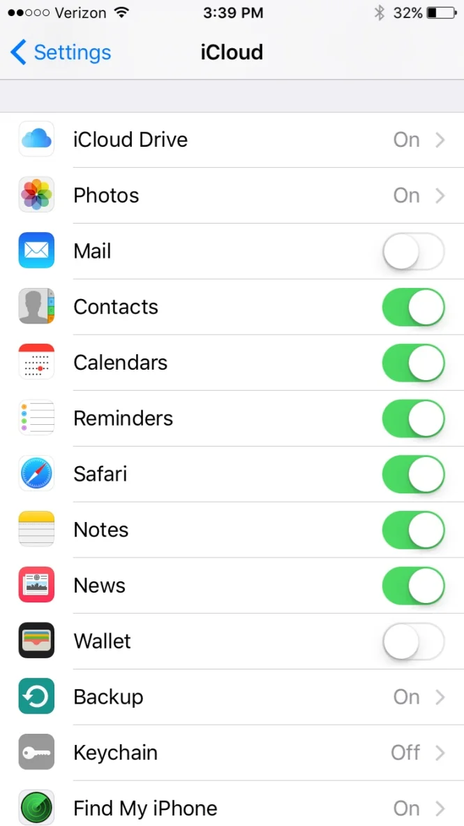
I do this using iCloud sharing between the devices.
To setup your iCloud sharing, go into your iPhone settings, click iCloud Settings, and make sure you have Photos set to ON.
Click on Photos and make sure “iCloud Photo Library” is selected as well as “Upload to My Photo Stream”.
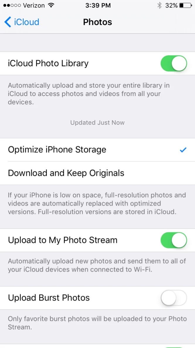
Now you need to go into the system preferences on your iMac or Macbook. Click iCloud, and make sure you have selected iCloud Drive and Photos.
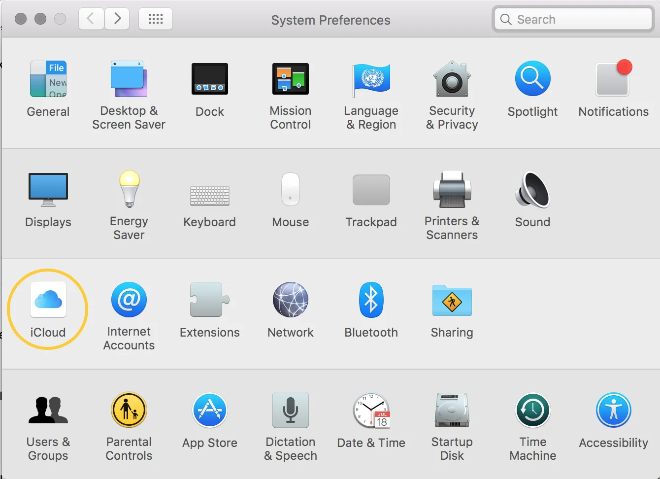

This should allow your photos to automatically upload into your “Photos” app on all devices when you capture them from your iPhone.

For those of you not using apple products, you can either email images to yourself, or simply do the editing from your phone. I’ll talk more about that in just a bit.
Choosing which photos to use.
This part can be tricky. In step 5 of part one, I told you to take too many photos. It’s easier to pair down, than to wish you had taken more.
How do you decide which images are the best? I use two very simple rules.
1. Select the images with the best color or exposure.
We’ve all taken photos that are too dark, too bright or washed out. Exposure is the amount of light in your photo. If it’s too dark, that means it is underexposed. If it’s too bright, that means it is overexposed—neither are things you want.
If they are visibly under or overexposed, go ahead and eliminate them from the group. This is typically the quickest way of tossing out the worst ones.
2. Select the images with the most desirable crop.
You want to do the least amount of work as possible during editing, so try and choose the images that require the least amount of cropping, adjusting, etc.
I look at things like alignment and positioning. Are the lines—created by notebooks and keyboards—straight with the edges of your photo frame? Is there enough of this flower or that pen showing? I like for some items to not be completely visible, which goes back to number 3 in my last post:
“ Try choosing 2 larger items (like a keyboard and notebook), setting them up first and then fill in the gaps with smaller, complimentary pieces (like pens or paper clips). ”
Focus on your primary items. Select the photos where those items are positioned how you want them within the frame. Once you’ve chosen a few images you like, start comparing those images by looking at the complimentary items.
Which pen positions look best, or which photo crops off the right amount of the pen? Narrow it down this way until you have only a couple images you like.
Editing your selected photos.
I realize this may be a sticking point for a lot of you.
You probably ask yourself questions like:
Can I use my iPhone for this? Should I use Instagram? Do I need to invest in programs like Photoshop?
In a nutshell: Yes, yes and maybe yes.
Yes, you can use your iPhone for some editing, but I would personally recommend Instagram for any editing you wish to do on your phone.
Should you invest in Photoshop? I say maybe, because it really depends on your current situation.
How much photography does your business require? If you are simply taking photos for Instagram and Facebook, you may not need Photoshop (or the other amazing program I’m about to introduce you to).
You can likely use Instagram for most of your editing needs.
However, if you are taking photos for your blog or website, or find that you can’t accomplish the level of editing you would like to, maybe it’s time for you to invest in a more powerful program.
Hopefully this next bit of information will help you make a more educated decision on how you should proceed.
Edit using Adobe Lightroom
I use Adobe Lightroom for 90% of my editing. I always start there and will sometimes finish up in Photoshop. I typically only use Photoshop for things I can’t get quite right in Lightroom. (I shamelessly admit Photoshop is my least favorite design program, so I try to avoid it when possible.)
In the below video, I break down each of the tools in Lightroom, and show you my editing process.
And here’s a before and after so you can see the difference.

If you are running a business and/or find yourself trying to edit photos on a regular basis, Lightroom will be the best investment you could ever make. (Thank you Lissa Anglin for introducing me!)
You can buy it as a one-time DVD installment for $143.00 on Amazon (link here).
Or you can buy the Adobe Photography Plan, which costs $10/month and also includes Photoshop (link here).
The Photography Plan seems like the better deal to me since you get both programs and will always have access to the most recent updates. But you do whatever works best for you!
Edit using Instagram
If you are editing on your phone, I suggest using Instagram. The app has a lot of really useful tools that make it super simple to do a quick edit.
Check out the video below for a quick tutorial on my Instagram-editing process.
Here’s a breakdown of the tools I used in the video:
Brightness: Increases the overall light or exposure in your image.
Shadows: Darkens or lightens all the shadows in your image.
Highlights: Pulls from the bright areas of your photo and “highlights” those areas.
Contrast: The “contrast” between highlights and shadows; This adjustment creates more definition between lights and darks.
Warmth: Adds more of a yellow tint to the image. It appears more like natural sunlight the warmer it is.
Sharpen: Helps define certain areas to make them appear sharper.
Before and after shot:
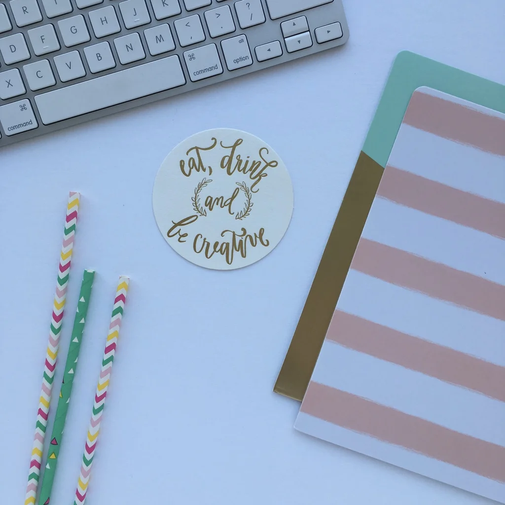
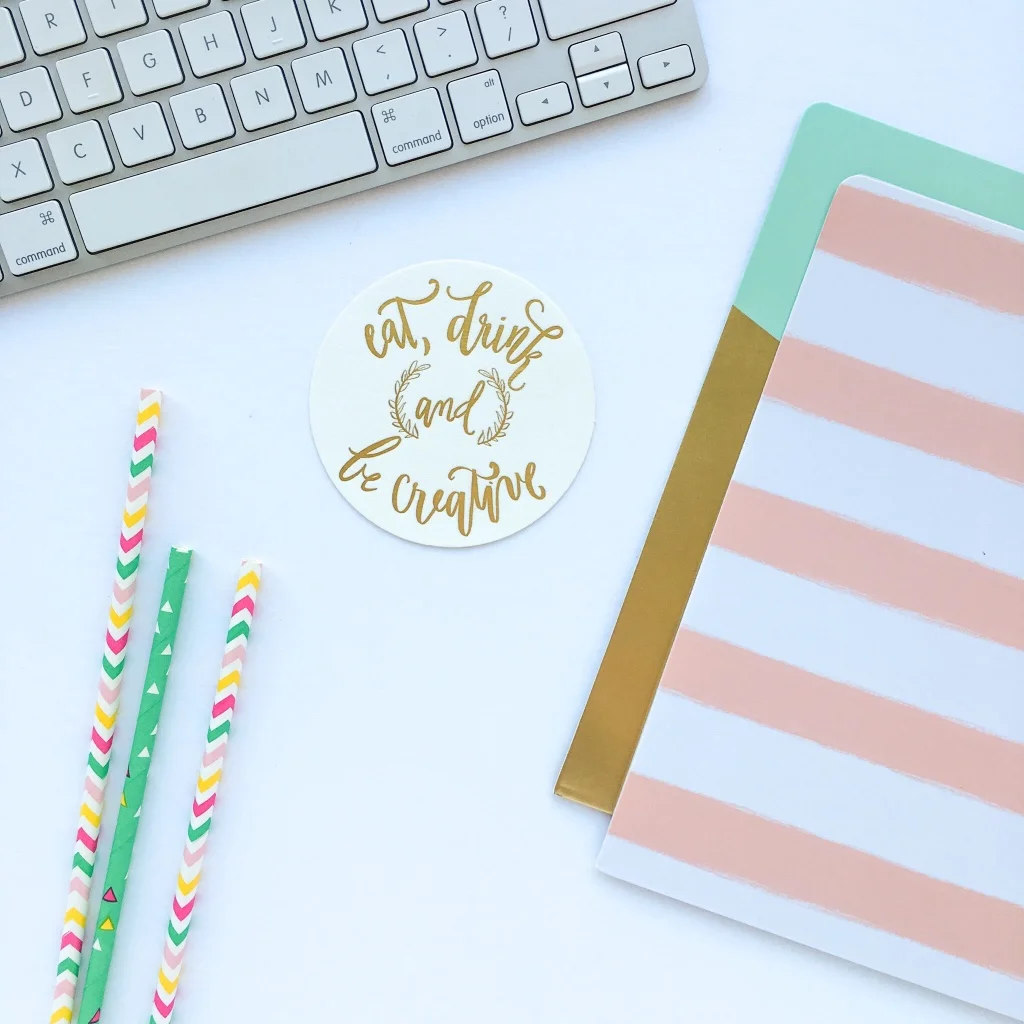
You may notice some people use square images and others use rectangular images of varying sizes throughout their Instagram feed. The main reason I always use square images is so my feed is consistent. It doesn’t matter what shape or style you choose, but be sure to use a consistent style throughout your posts.
I hope you guys learned a little more about how to take quality photography for social media. If you have any questions at all, please feel free to email me or ask in the comments below!